In this election season in Malaysia, we see manifestos flying left & right as the powers that be or just wannabe attempt to communicate/sell their unique brand/political point of view to the rakyat. Is it just me or do most if not ALL the design & layout of the contesting parties' manifesto statement documents look tired, dated, so "last century" and not very inspiring visually? eg. download > BN (5.2Mb), DAP (0.4Mb), Keadilan (2.6Mb), PAS (15Mb). Last minute rush jobs? Can't afford to hire art directors/graphic designers? What does that say about the understanding or appreciation for good design among those who walks in the corridors of power in Malaysia? Does it even matter? What do you think?
But wait-a-minute, manifestos aren't just churned out by political parties.
Thursday, February 28, 2008
ChangeThis Manifesto
Friday, February 22, 2008
Malaysian Graphic Design Survey 1
 Our resident researcher, Irina invites you to take part in her little survey on the Malaysian design scene as part of her UiTM masters research which investigates the need for a centralised design resource center in Malaysia. It's only 10 short questions, click here to begin.
Design Refreshments
Call yourself a graphic designer? Do you have the necessary foundation skills and knowledge to do the job? Not all designers have the privilege of a proper design education or to learn from dedicated lecturers who inspires learning even with the most mundane of subjects - maybe typography or art history?
It's when you are out working in the real world when you suddenly wish you had paid more attention in that certain class. But learning is a life-long quest. We never stop learning so don't despair if you don't know or forget a fact or two. Most designers learn on the job anyway. For those keen on continuous learning or just want to brushup, here's an online magazine, "Before & After" that's dedicated to making graphic design understandable, useful and even fun for everyone. They are a great source of short & sweet design tips, delivered with beautifully crafted design makeovers based on basic design foundation & communication principles. It's a subscription service but you can still download free samples each month like the ones shown below...


1. Design a Logo of letters! Are you known by your initials? Turn those letters into a terrific signature! 2. How to cool a hot photo. When your photo can't be changed, surround it with cool color. 3. What's the right typeface for text? How to choose a typeface for clear, easy reading over long distances.
If you want more free samples like the ones below, you can if you register as a myPantone member (FREE) as mentioned in the previous post. Register, login, then goto Tips & Techniques section...


1. Design a story-style brochure. Fold-and-undfold-a single sheet into an appealing, narrative-like presentation. 2. Create Web page Photo backgrounds. Make pages so real it’s like being there. 3. Design simple presentations. Visual brevity will help a great talk.
Monday, February 18, 2008
Color Palettes for FREE
 I have a long-term love-hate relationship with the Pantone system. Much as I enjoy picking out mouth-watering spot color hues from their expensive collection of "fan" color swatches booklets for a design project, getting the work to look/print accurately to specs (or to look like the swatch) is a never-ending challenge.
Like playing lottery, hit & miss, die now must recalibrate/redo/blame the poor printer? Choosing a color palette for a design job is a matter of technique (which can be learnt) and taste (something you're born with or not). For those not born with it, there are design books offering ready-to-use color palettes that are proven to work as a shortcut to picking your own palettes. For those who need a shortcut...  Pantone now offers online color palettes for FREE download that reflects latest color trends & other user-submitted ones. Subscribe (FREE) to their e-newsletter as a myPantone member & download lots of goodies including great "Before&After" design makeover pdfs for the designer looking for some inspiration.
Thursday, February 14, 2008
I Love Dogs _21Jan smalltalk review
 review by: Irina Muis
Don’t be afraid, it won’t bite you. How would you like to have a pet dog that does whatever a normal dog does, yet doesn’t eat, poop or die? Then I’d like you to meet Bobby, the interactive new media installation by Edwin Yiing.
“I love dogs” is Edwin’s final project as a multimedia design student at The One Academy. Driven by the desire to explore extraordinary usage of the webcam and speaker, Edwin was able to produce a 2D onscreen virtual dog that could interact with the ‘owner’ in real time.
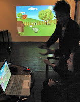
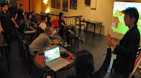 With the installation projected on the wall, Edwin demonstrated how he could walk, run, jump and even play ball with Bobby. You could even show your love to Bobby by patting him on the head! Later everyone was given a chance to experience playing with Bobby just by putting on a black pair of gloves...
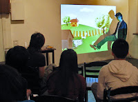
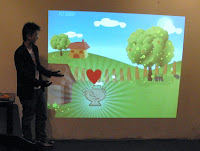 Citing Nintendo Wii and YouTube as his inspiration and research, Edwin set out to use minimal technology as opposed to the expensive equipment usually related to new media. Overall, it was cool and an eye opener, you would never fully understand new media unless you experience it yourself.
Hopefully other designers would be similarly inspired to challenge the norm in producing future works.
// DOWNLOAD
Edwin has kindly made available for those of you interested to experiment in this area, a flash actionscript file that made the motion detection feature possible in his project. Download it here. 515kB zipped.
Monday, February 4, 2008
Chinese New Year break
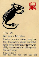 kakireka smalltalk series will be taking a break in February since since our chosen dates of 7th & 21st of every month in February falls smack in the middle of Chinese New Year and Chap Goh Mei where the chinese hold big family reunions.
So the next smalltalk will be on the 7th March 2008. Have a good holiday and we wish all our chinese readers Happy Chinese New Year! Kong Hei Fatt Choy!


